THOUSANDS OF FREE BLOGGER TEMPLATES

Thursday, 25 March 2010

8th day of Campaign Unit

Today started when we chose the pictures which we are going to use for our final design and also I sorted out my Campaign Unit folder. It was hard to decide what pictures to use because we had a lot of pictures taken the lesson's before. Here are the pictures which will be included in our final leaflet:

We will use this cup as the main cup in the leaflet, it is good because the logo is facing the front.
This is our background, it is blurred so that the leaflet is focussed on the cup and the text.
We are going to use the lid of this picture.
We will use this Mr Moo picture as the small cup near the corner which will have text near it.
This is the Shakin Moo's logo which we will use for our final leaflet. We started our final leaflet on Adobe PhotoShop. The first thing that we needed to do was to choose the right size for our leaflet. It should be A5 but unfortunately there wasn't an option. James suggested that I should select A4 format and then half the size. It worked. The second thing that we needed to choose was the background. Here are the two background pictures which we had to choose from.
I didn't like this background picture because there is too much detail and things going on there. If we would choose to use this picture than it would distract the audience eye from the main objects.
I personally like this background picture more than the other because it's blurred so that the main objects would be focussed. The only member of our group that liked the first background picture was Michael. Because he liked the first picture more, we asked other members of our class for their opinion. Most of the people like the second background picture. Here is a picture of how our leaflet was looking so far:
I added the cup and the lid by using the crop tool. It was very difficult to keep the edges straight and consistent, and it took a while until the lid and the cup where together. Fortunately I succeeded and we also added the Shakin Moo's logo in the bottom corner of the leaflet. Now it was looking like this:
I was amazed that the corners were smooth and you couldn't see that the picture have been cropped out. To make it even more smoother I blurred the corners when in zoom so you don't see any crop marks. We also added the small cup and added the steam. To make the steam was one of the most hardest things. I used a YouTube tutorial to help me, here is the link :
http://www.youtube.com/watch?v=lVk7X_byMxk
It really helped me because there is no other way to make steam. I tried to search for steam in Google but I failed. I made 3 layers of the steam so that the steam looks more real like. Now it looked like this:
I really like it and I think it's effective. It took as ages to get to this stage and I think we have done very well. We wanted to add the Shakin Moo's text which Chris Lane sent us, but we could not install it because the administrator has banned access to the control panel. We didn't have much time so we decided to do it next lesson. All we need to do now is to add the text and check for any mistakes. I am very proud of my groups work today.

Hi Matiss

Nice blogging - you are showing your progress and thinking very clearly. Try setting some goals and plans for the next session.

Tuesday, 23 March 2010

Seventh Lesson

Our day started when we went to the Shakin' Moo's and took pictures which we needed for our final 'Hot Shake' poster. I brought my own camera and we got given another one by the teacher. It was difficult to capture the main objects because there was a lot of things in the background. We took about 30 pictures and when we got back we chose the 9 best ones and edited them on Adobe Photoshop. I suggested that we each edit 3 of the 9 pictures to make the pictures more proffesional, such as if it's too dark make it lighter. Here is the first picture which I edited before:

Here is the first picture which I edited after:
I made the picture better and more professional by making the picture lighter and I got rid of the messy background. I think that it looks better when I edited it.
Here is the second picture which I edited before:
Here is the second picture which I edited after:
I changed the light and I got rid of the distracting background. It was very difficult to get rid of the fingers because you had to use the stamp clone. After some practice which I did before I got used of doing it and now I know how to do it properly. Here is the third picture which I edited before:
Here is the third picture which I edited after:
It was easier to edit this picture because I edited a picture like this before. This edited picture is going to be very usefel for our final design because we might use it as the cup on the final 'Hot Shakes' leaflet. Here are the ones that James did:
I think that he done a good job and I really like them. When we took the pictures we made a mistake. As you can see on these pictures the Shakin Moos logo is not facing the front. I was very dissapointed when I saw this, but we still have a lot of other good cup pictures.

Overall I think that I did very good piece of editing which we are going to use. Next lesson we are going to start our final 'Hot Shakes'.

Thursday, 18 March 2010

Hi Matiss

Nicely illustrated but try to be more detailed.

Thursday, 11 March 2010

First day of making the leaflet on Adobe Photoshop

Today we started to make our final design leaflet on Adobe Photoshop. At the start we thought that it is going to be a bit easy but unfortunately it wasn't. We tried to crop this image for our leaflet, but because we are not used to using Adobe Photoshop we failed. Here is the image that we tried to crop.

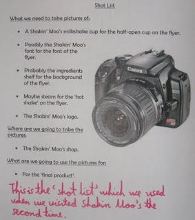
We wanted to crop out the cup and then to open the lid using Adobe Photoshop but after a long time of trying we didnt succeed. Mr Hind wasn't here which meant we couldn't ask for help. To not waste time we created a shot list of photos to take in the field at Shakin Moo's. Here it is:

I practised how to combine 2 images seamlessly in Adobe Photoshop. I found a YouTube tutorial that helped me. Here is the link:
http://www.youtube.com/watch?v=StBOo5RsHds&feature=related
I succeeded and now I know how to do it. Here is the picture which I made:
It looks pretty simple but actually it was hard. I had to firstly crop and then smudge the worm image to make it a like. I am going to use these skills which I learned in the next week to help the group.

Thursday, 4 March 2010

The second day of planning

Today I improved my final idea by adding some more information on it. When people pick up leaflets they usually want to know where the shop is and if they have any special offers. So I added the address of the Shakin Moo's and special offer to attract people's attention. Here is a picture of it before:


Here it is after:

We each have now done a final idea, here is James's final idea:

I think that his idea is very good because it attracts attention and makes you want to buy the hot shake. Here is Michael's final idea:

I think the idea is good but it could be better. After that we made a questionnaire, unfortunately we failed on our first attempt because we released that it was hard to fill out and was very basic. We redid it by making the questionnaire tally type. After that we asked 11 people to fill it in. Here it is:

By looking at the questionnaire I realised that everybody likes the James's idea more than mine or Michael's. This means that in the next lessons we are going to start to do his idea on the computer, it is going to be hard to replicate the idea because the idea is drawn by hand.